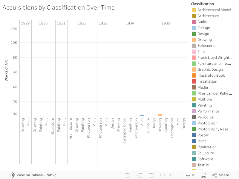
The bar chart above represents the number of acquisitions by department through time. Once again, 1964 and 1968 stand out as years in which sizeable amounts of acquisitions took place, but as opposed to the visualization presented in the departments section, this chart shows what types of objects were acquired – illustrated books and photographs respectively.
As we get more granular, we also notice the acquisition of almost 3,000 drawings in 2005, 2,500 prints in 2008, and the acquisition of Multiple starting in 2008 (Fluxus Collection). We also see a degree of consistency in the numbers of acquisitions of photographs since 1959, which becomes much more pronounced from 2005 onwards.
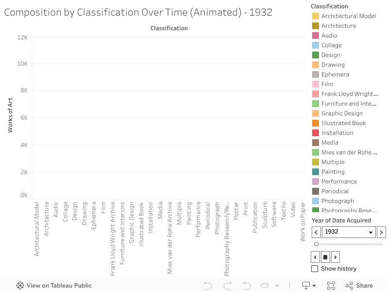
These same trends may be also readily identified in the animated bar chart below, though its strength resides perhaps in the effectiveness with which it dynamically highlights spikes.